
Greek Island Coastal Aesthetic: Dreamy Mediterranean Art Ideas

Greek Island Coastal Aesthetic: From Photo to Dreamy Mediterranean Art
There's a specific kind of calm that the Greek islands put into a picture — whitewashed walls, a blue dome, that impossible turquoise water — and it's having a moment as a coastal-aesthetic wall-art look. This is a little gallery of that feeling in three forms: the real islands as the camera sees them, the same scenes reimagined as dreamy digital art, and one turned into a watercolor you can paint yourself. Save whichever ones speak to you — and if the painting bug bites, there's a short how-to at the end.
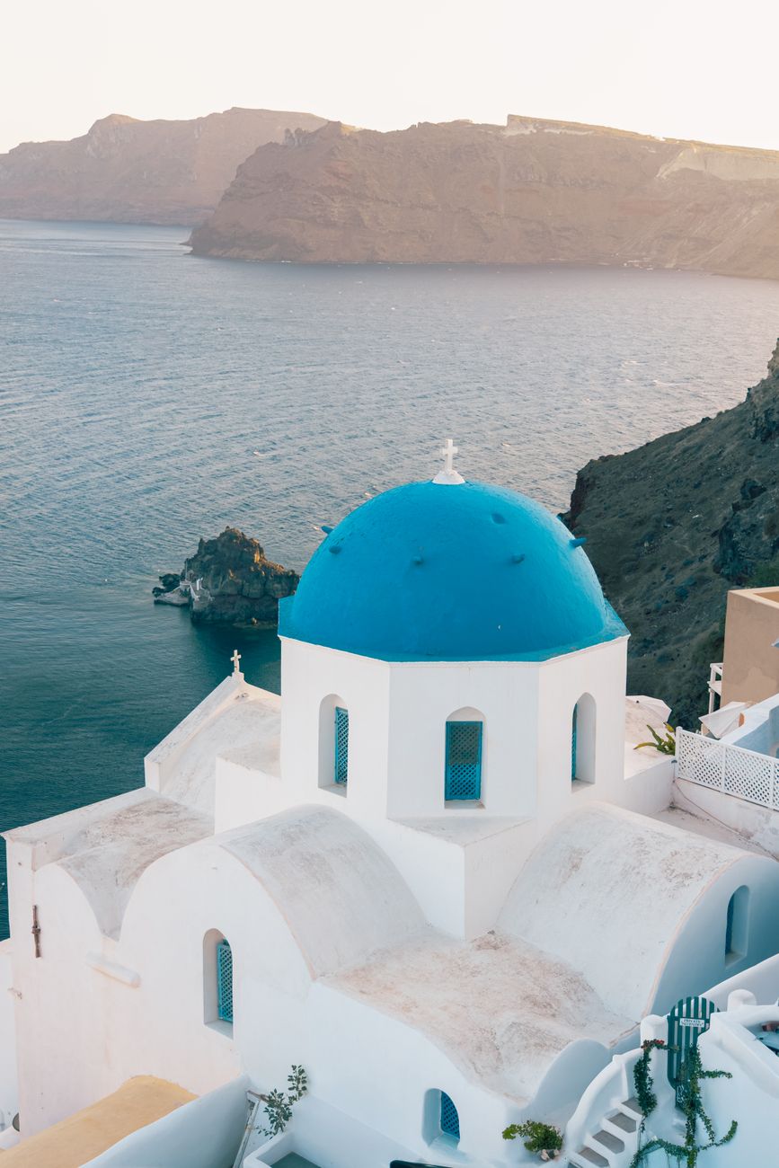
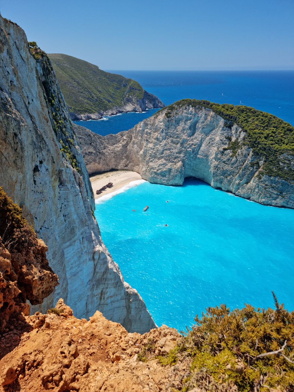
The real islands
Start with the source. Half the magic of the Greek-island aesthetic is just the light on white and blue — it does most of the work for you, whether you're framing a photo or planning a painting.
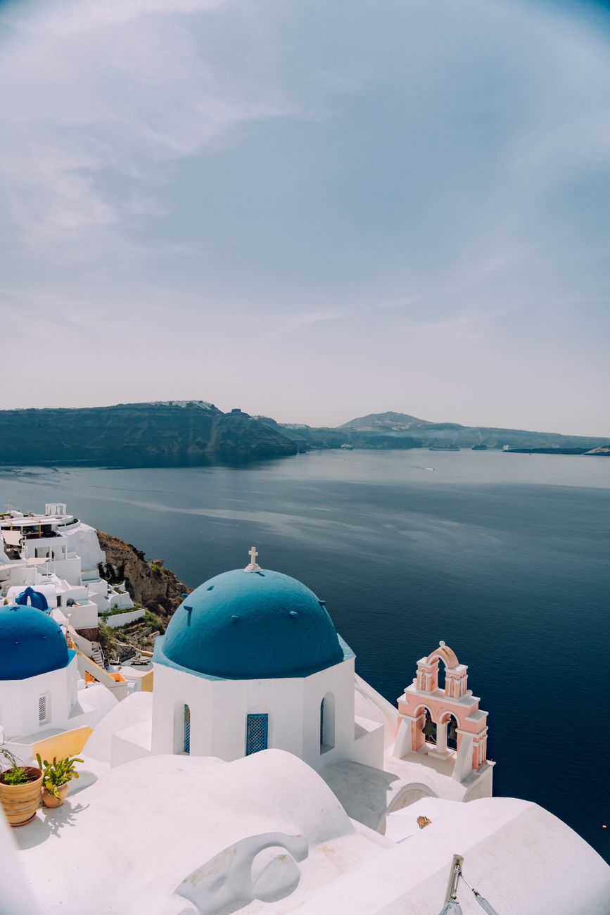
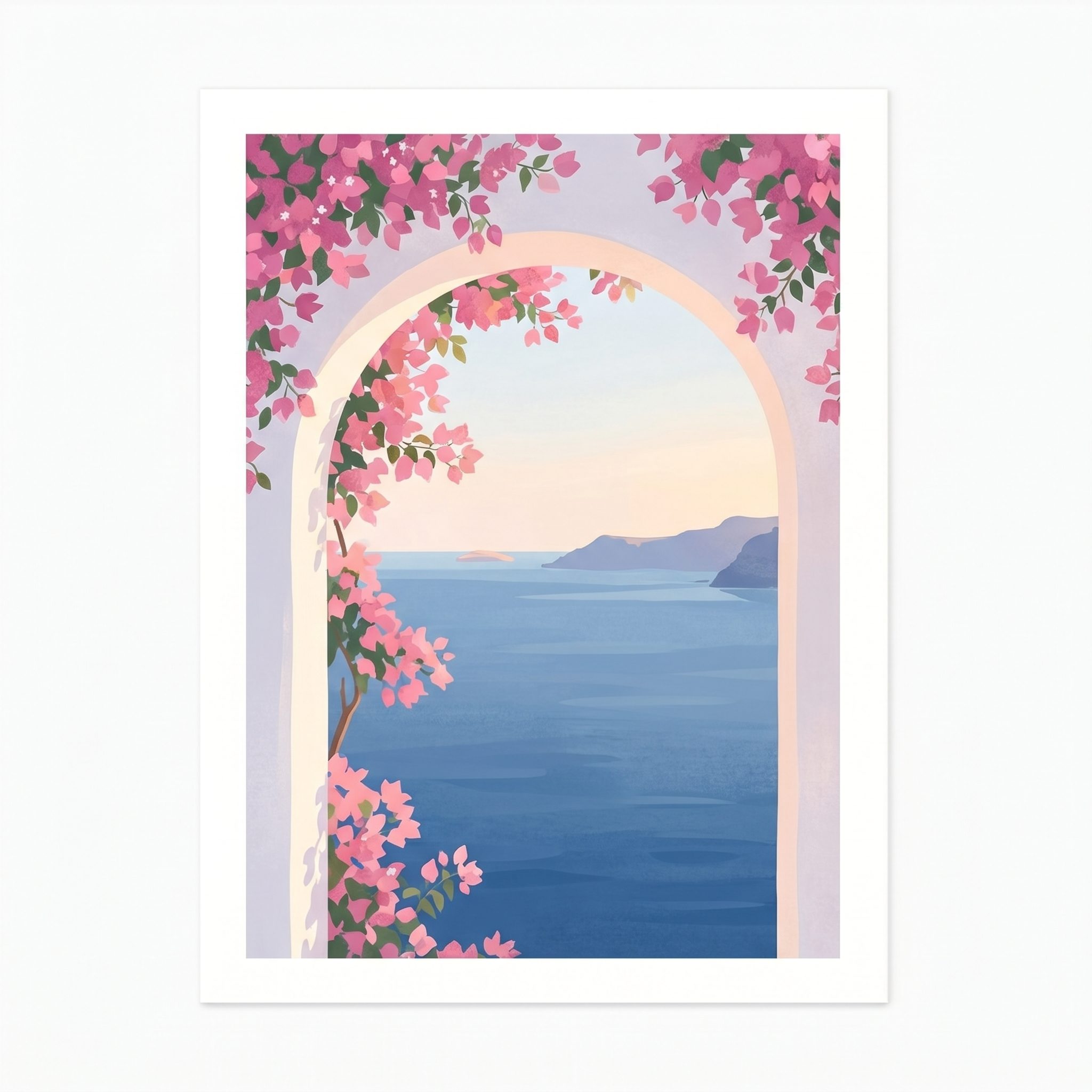
A single blue dome against the sea is practically the whole aesthetic in one shape — calm, graphic, unmistakably Greek.
And then there's the water. The turquoise of a hidden Greek cove is the color everyone tries to mix and never quite believes is real.
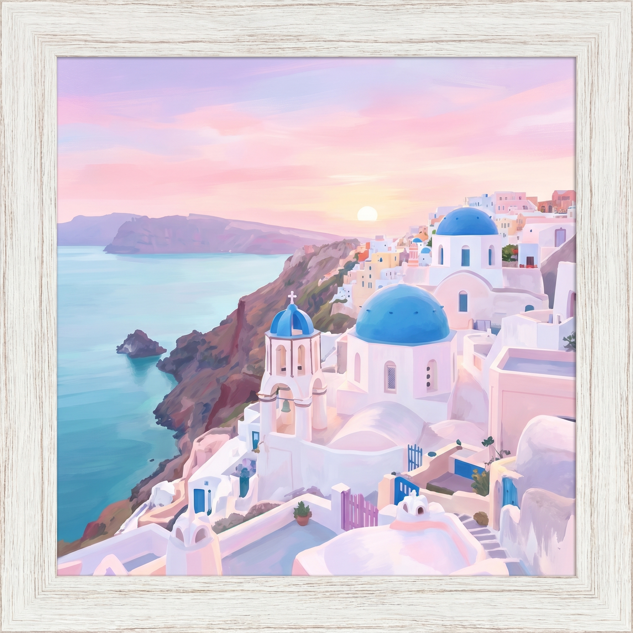
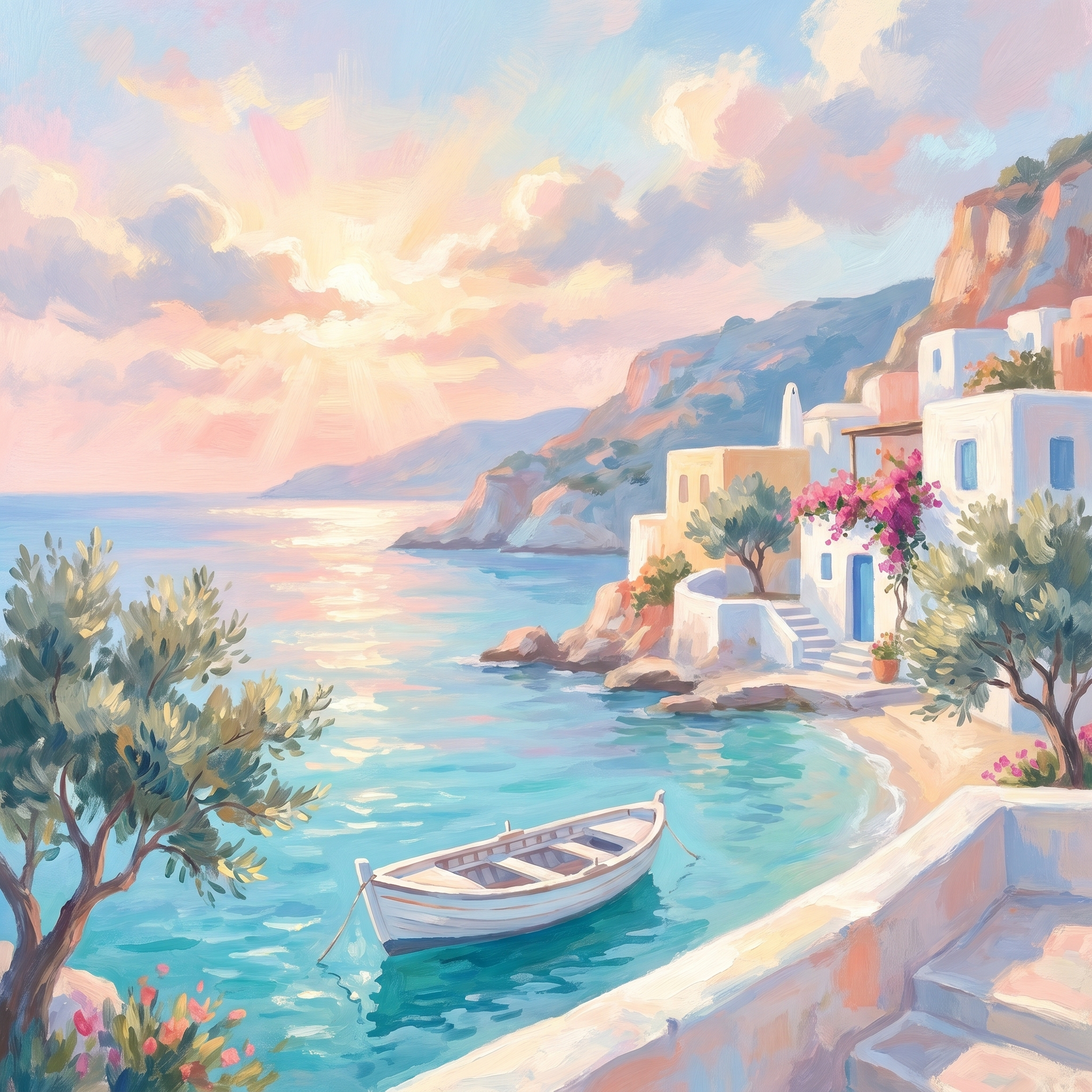
Dreamy digital coastal art
Soften that same scene into pastels and it becomes the pink-sea, golden-hour version of Greece — the dreamy, painterly look that's everywhere in coastal-aesthetic and Mediterranean wall-art feeds right now.
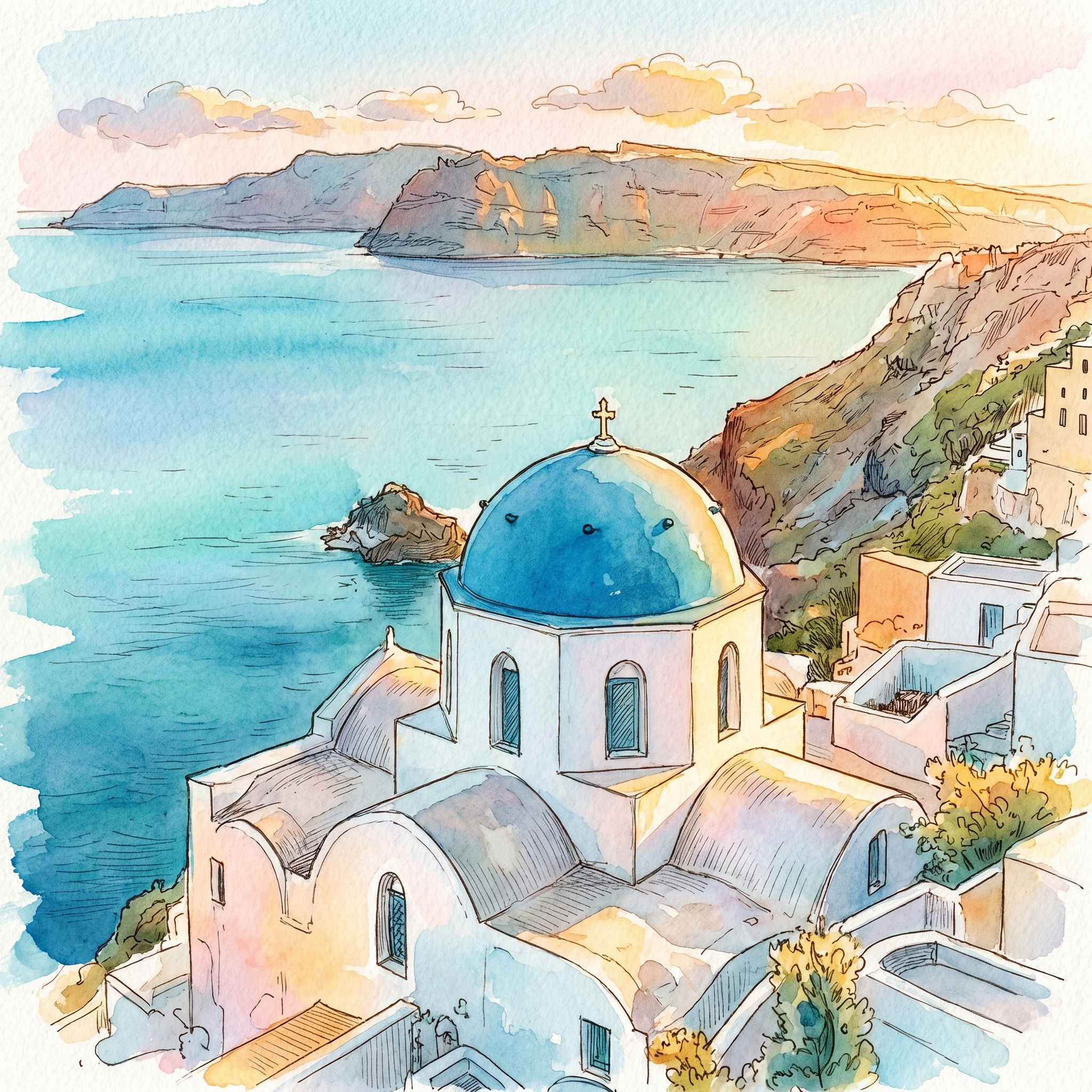
Painted: from photo to hand-drawn watercolor
Here's the part I love most — taking that first Santorini photo and letting it become a loose, luminous hand-drawn watercolor. The colors are already there in the scene; painting just means simplifying them down to a few washes and a little ink line, and trusting the white of the paper.
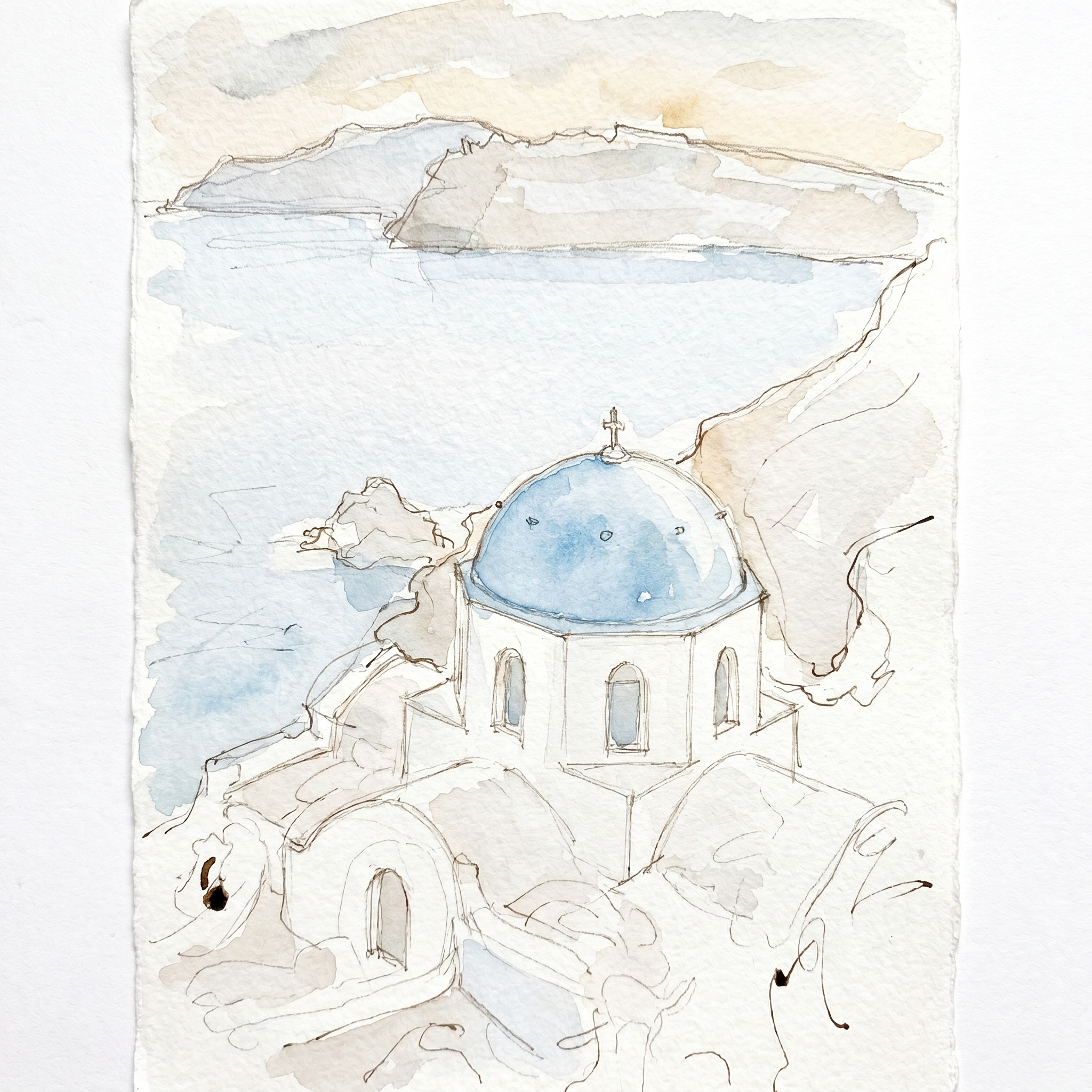
It builds the way any watercolor does — a light sketch first, then colour washed in stage by stage:
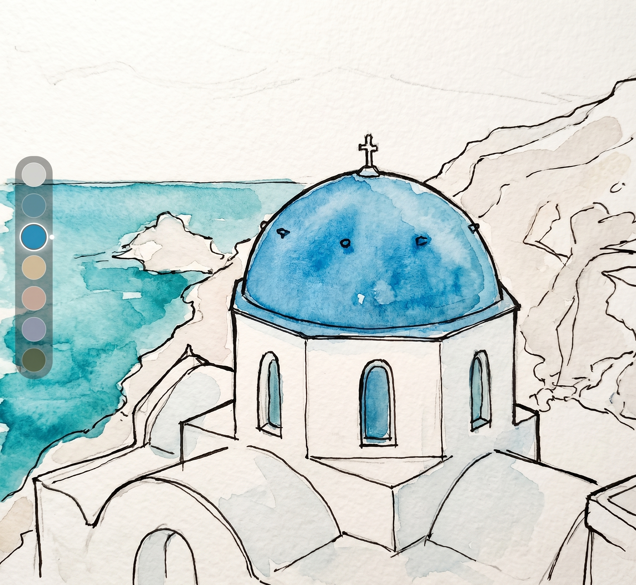
Paint your own Santorini dome (the quick version)
- Draw the big shapes only. The dome, the white block of the church, the line of the sea. Skip the detail.
- Wash the sky and sea first. A pale blue wash, leaving the white buildings as bare paper. Let it dry.
- Drop in the dome. One confident wash of bright cerulean/turquoise; let it pool darker at the bottom for roundness. Don't touch it again.
- Shadow the white. The buildings aren't white — they're pale lilac-grey in shadow. A few soft cool shadows give them form.
- Tiny darks last. Windows, the cross, a doorway — a few small marks, and stop. Watercolor lives on restraint.
The whole appeal of this aesthetic is simplicity — a few shapes, a few colors, a lot of light. If you catch the coastal-painting bug, the same loose-and-luminous idea carries straight into painting easy ocean waves or a cozy seaside daydream. Which of these would you put on your wall, or paint first? Tell me below.
You might also enjoy these articles: