
Lake Como Aesthetic: Dreamy Italian Lake Coastal Art Ideas
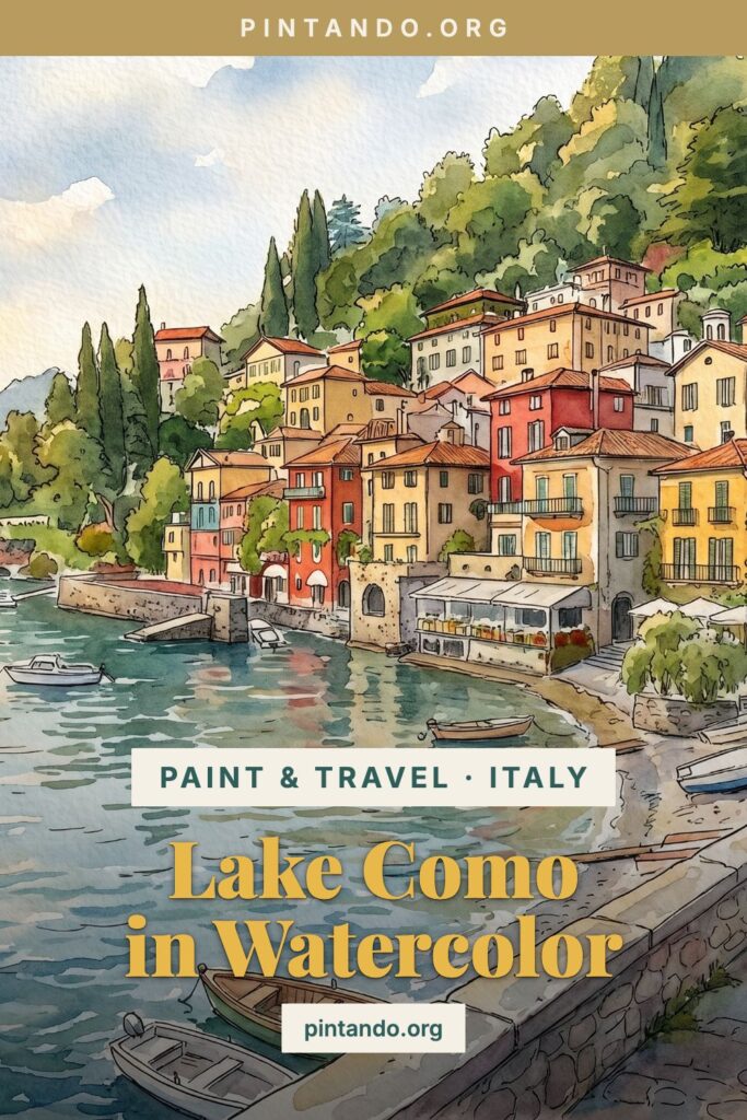
Lake Como Aesthetic: Paint & Travel to Varenna
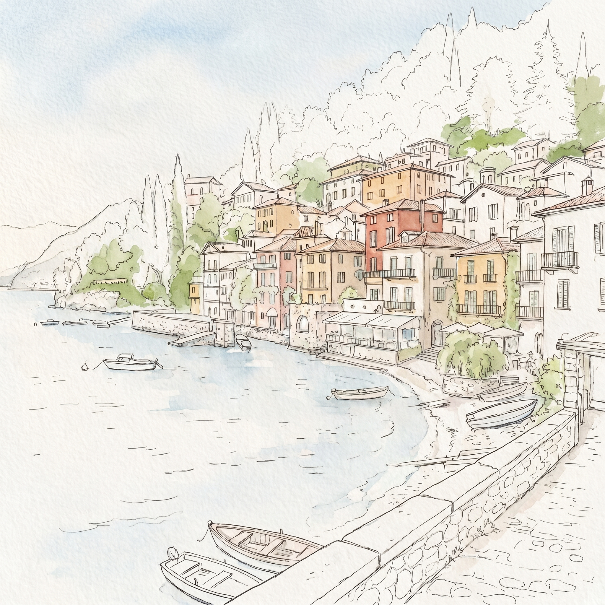
The Paint & Travel series sails north — from the Mediterranean coasts to the cool, elegant water of Lake Como. And the place to start is Varenna: ochre, coral and butter-yellow houses stacked right at the water's edge, dark green cypress and mountains rising behind, a few little boats tied up below. It's the whole Italian-lake aesthetic in one view — and it makes a gorgeous, surprisingly easy watercolour.
Here's the same view three ways: as a hand-drawn watercolour you can paint yourself, as the real place, and as dreamy digital art. (Catch up on the rest of the series — Santorini, Mykonos, Crete and the Amalfi Coast.)
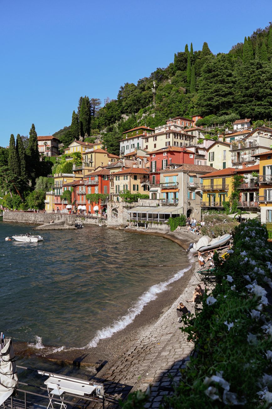
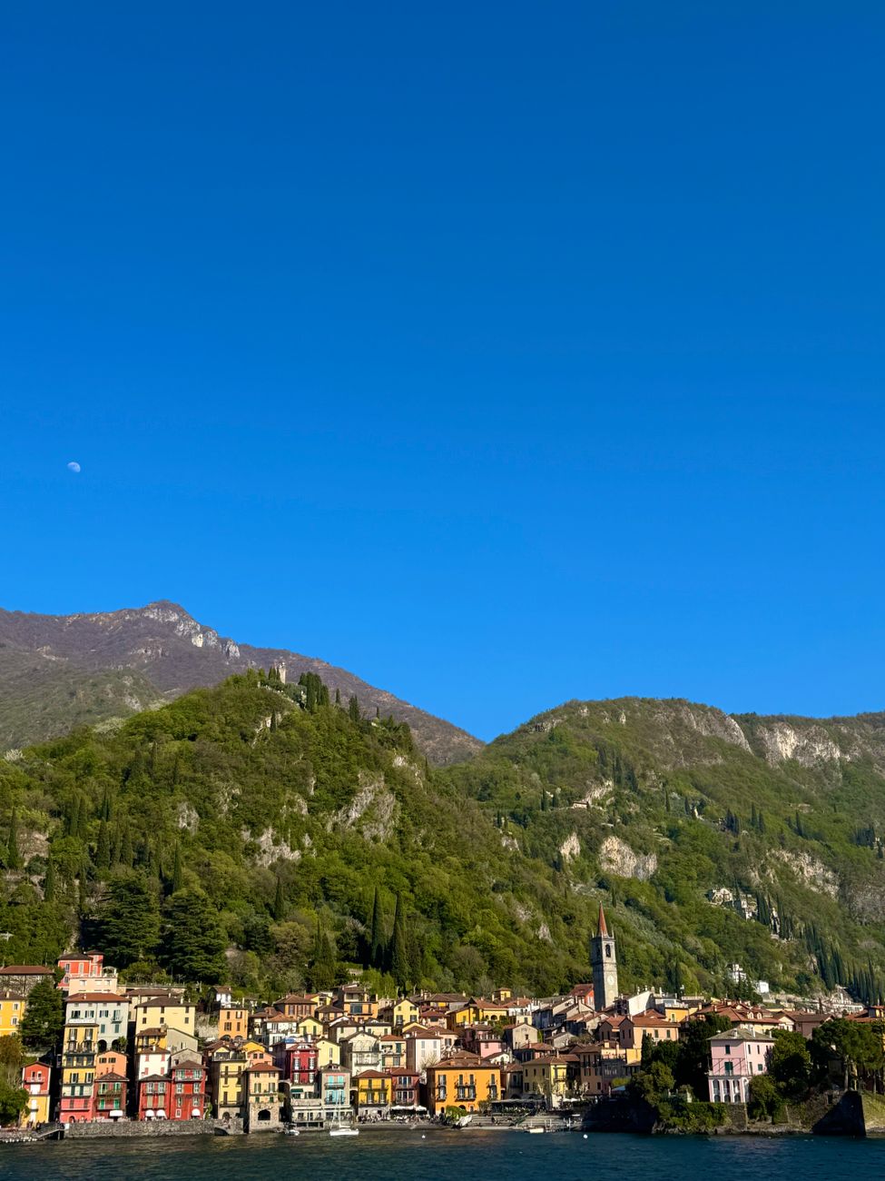
The real lake
This is Varenna as the camera sees it — the colours are all there, you barely have to invent anything.
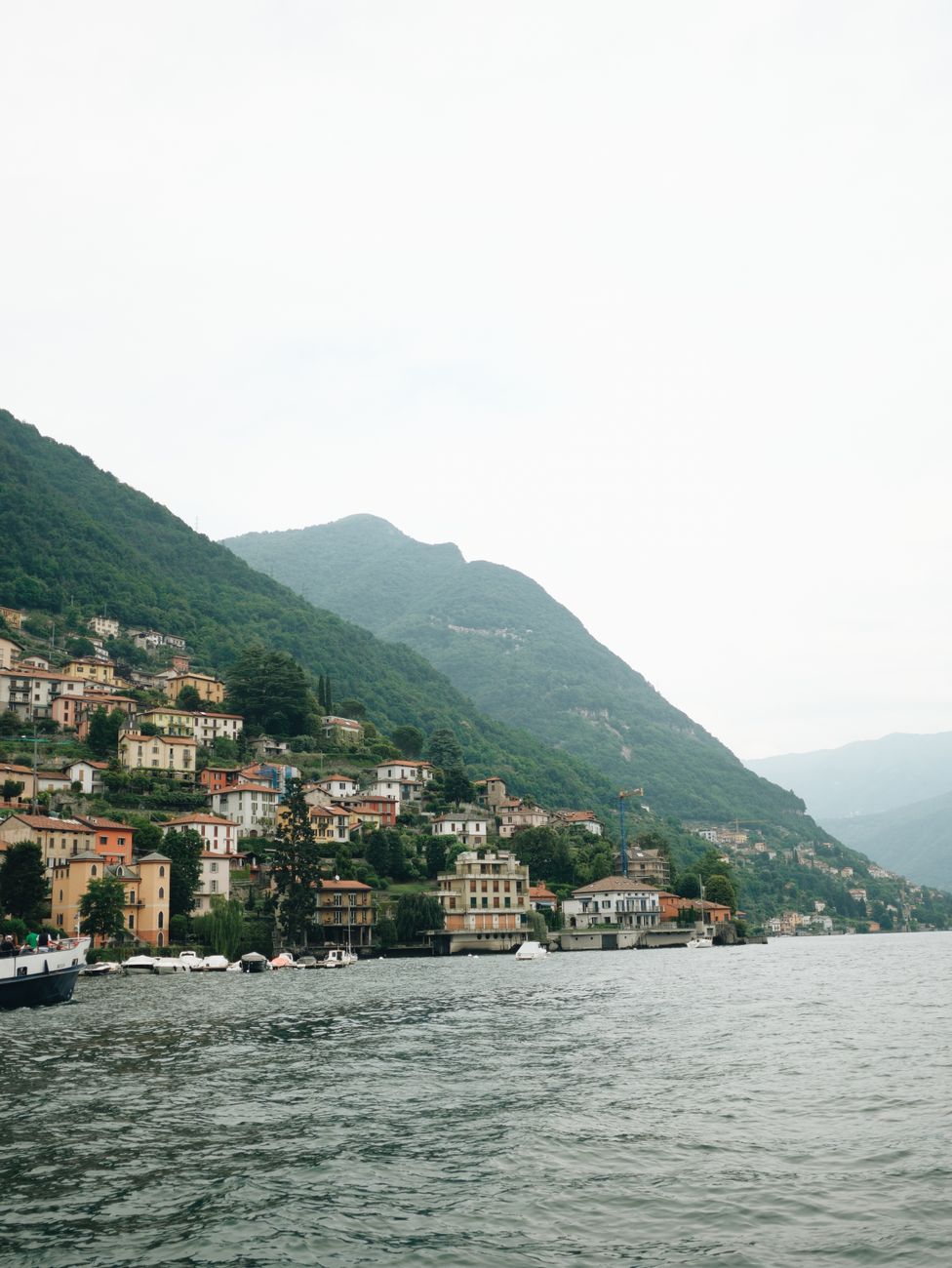
Step back and the lake does its quiet, grand thing: still water, soft mountains, a village tucked at the foot of it all.
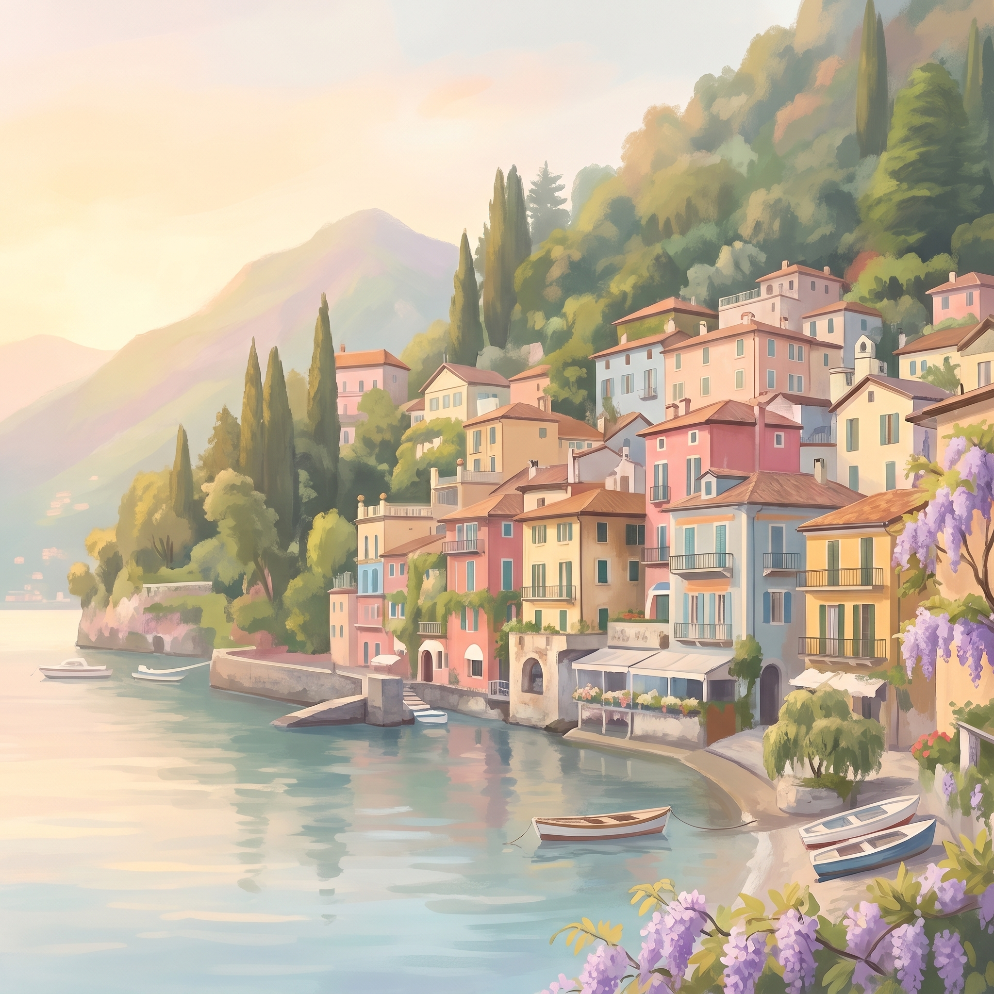
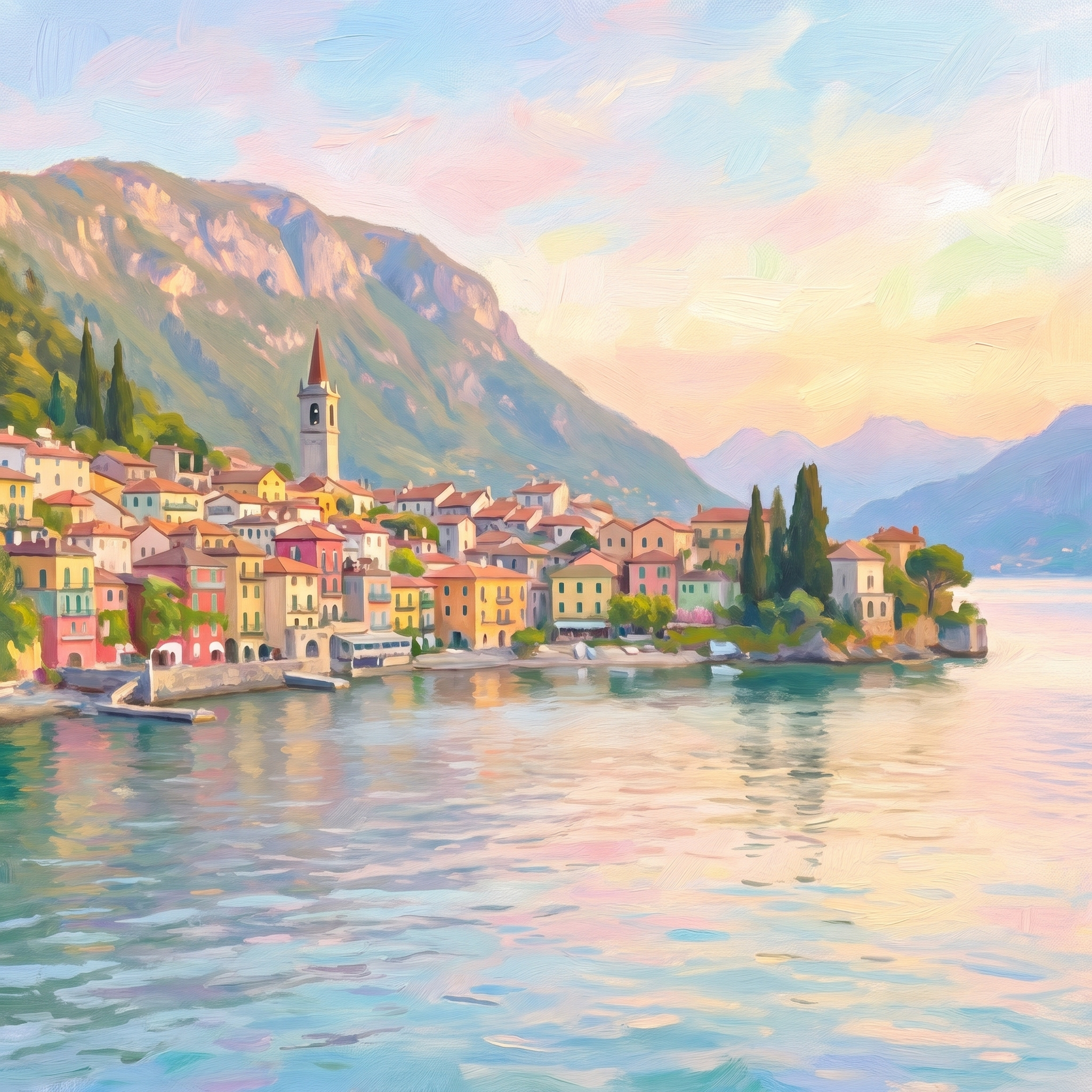
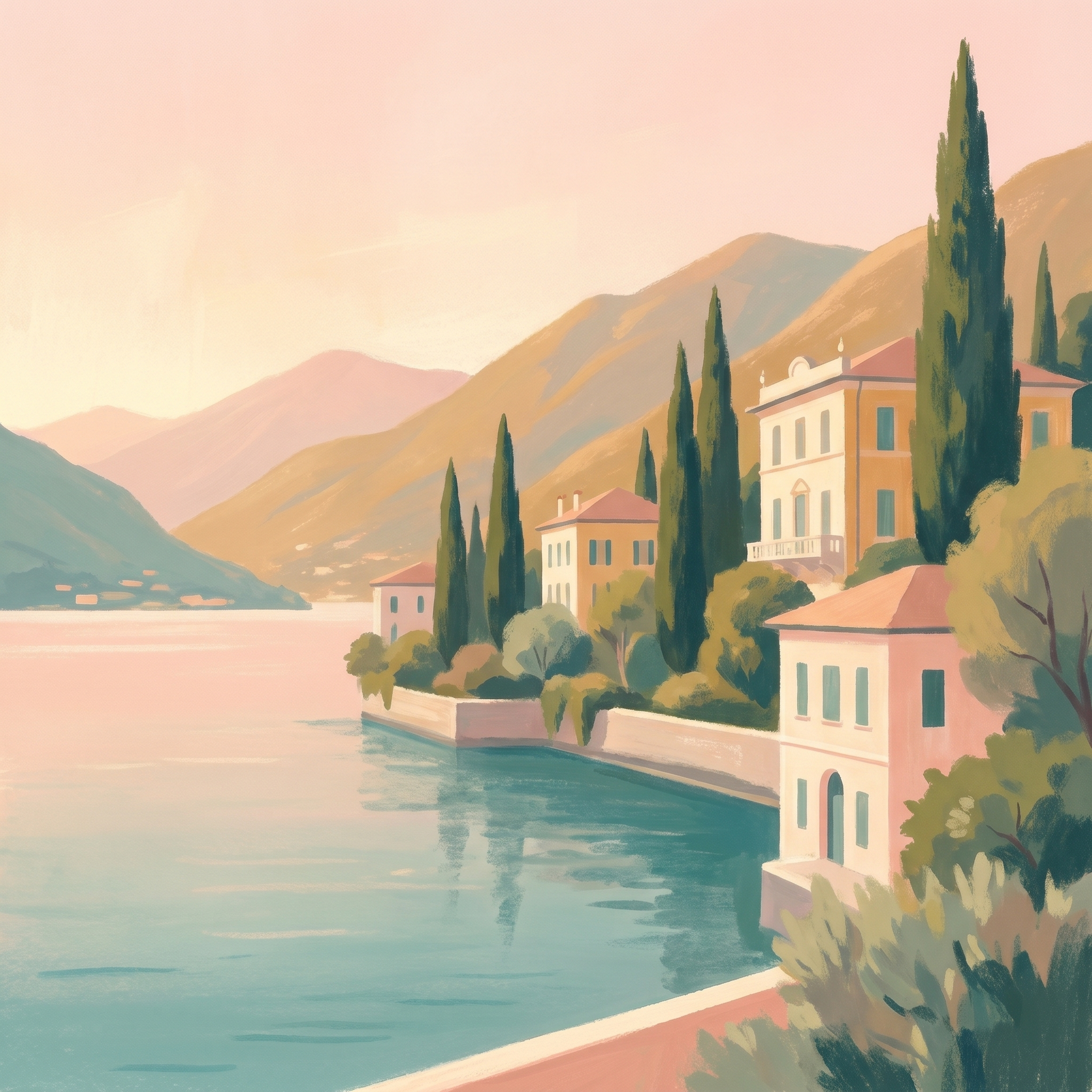
Dreamy digital coastal art
Soften it into pastels and Lake Como turns into its golden-hour, romantic self — the dreamy, painterly look that fills Italian-aesthetic and wall-art feeds.
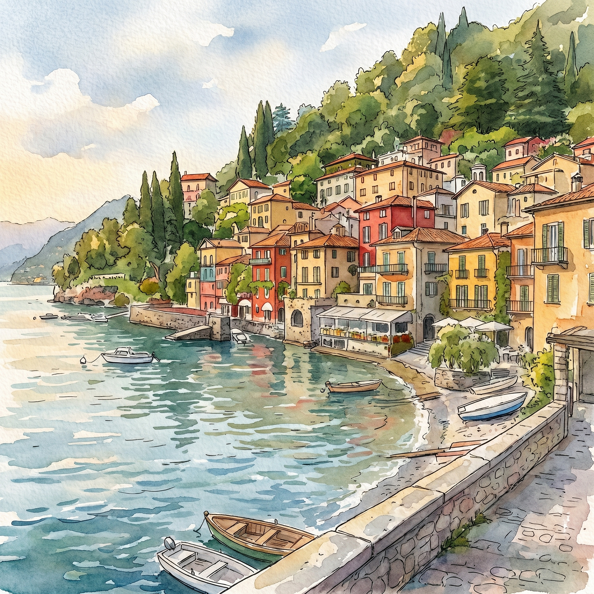
Painted: how the watercolour was built
That first hand-drawn watercolour looks involved, but it's really one long row of little coloured boxes sitting on a band of water, with green above. That makes it a friendly, easy summer painting. Here's how it comes together, stage by stage:

Paint your own Varenna (the easy way)
- Draw the waterline and the row of houses. A horizontal line for the lake, then a row of simple boxes along it — different heights, squeezed together. Hint at the mountains behind.
- Wash the water and sky/hill. A calm grey-blue lake below, soft green hillside above, left lighter where the light falls.
- Colour the houses loosely. Ochre, coral, terracotta, butter yellow — one quick wash each, white gaps between them. A few darker green cypress spikes between the roofs.
- Add the reflections. Drag the house colours straight down into the water with a wet brush — wobbly is perfect; it reads as a reflection.
- Ink the details last. Windows, rooflines, a couple of little boats — a few fine pen marks, then stop.
The whole appeal is simplicity — a few shapes, a few colours, a lot of calm water. The same easy approach works on the Amalfi Coast and Santorini's blue domes. Where should Paint & Travel go next — and which Lake Como view would you paint first? Tell me below.
You might also enjoy these articles: