
Paint Poppies Green First for a Blazing Red | Watercolor
Why Are These Poppies Green? The Trick to a Red That Blazes Like Silk
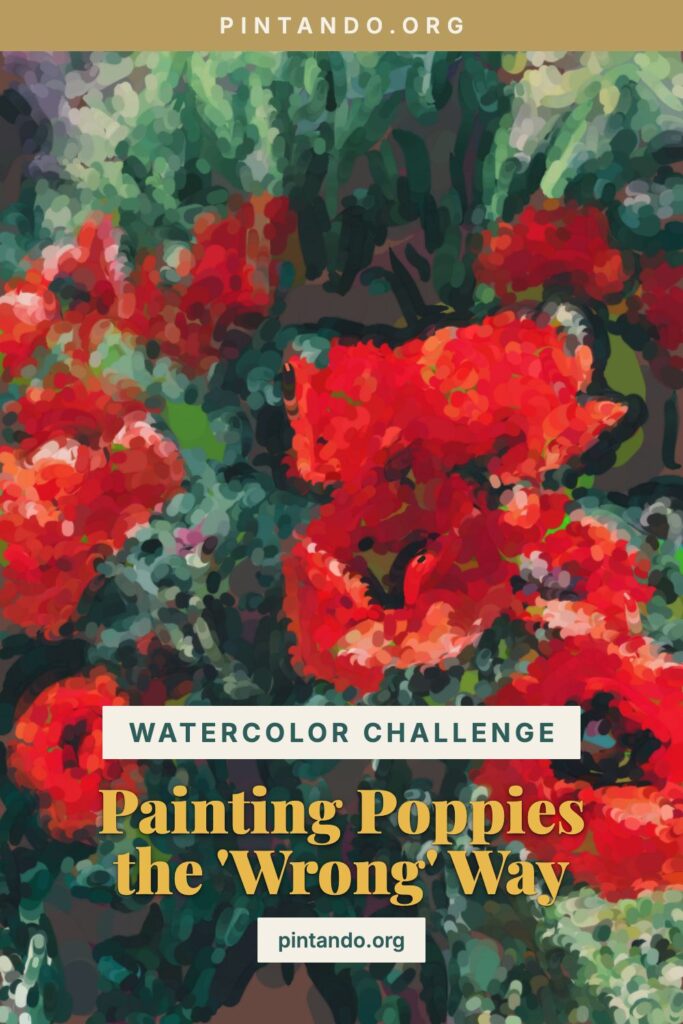
In the video, a spray of poppies starts out an unlikely green before igniting into that pure, papery scarlet that makes a poppy field look like it's on fire. The green throws people — poppies are the red flower, after all. But that green is exactly why the finished red blazes the way it does, and poppies might be my favorite flower to prove it on.
Here's what makes them special. A poppy petal is almost weightless — thin as tissue, slightly translucent, so light passes through it and the red practically glows from behind. You can't get that backlit-silk quality by piling on opaque red; it just sits there. You get it by glazing a luminous red over a cool foundation so the color stays transparent and lit. The wrong-color start is what keeps it that way.
Why painters start with the wrong color
The principle in one sentence: every color has an opposite, and opposites make each other louder.
Red and green sit directly across the color wheel — they're complements, and they make each other roar. Lay a green note beside a red and simultaneous contrast drives the red to its hottest. Glaze a transparent red over a cool green base and the red ignites against the cool breathing up through the paper, staying luminous instead of going chalky — the glow that flat red can never give you. For a flower that's already half-translucent, that transparency is everything. And there's a built-in bonus: a poppy's stem and the bud beneath the bloom are actually green, so the same color you hide under the petals does honest work right next door.
This isn't new. Renaissance painters underpainted skin with a cool green-earth verdaccio so the warm tones glazed on top would glow against it — you can still glimpse the green in thinly painted old panels. (An honest note: the "wrong" underpainting here reads as a muted green rather than a perfect violet, because we're tinting a warm subject down with a low-saturation cool base. The mechanism is identical: cool foundation, luminous warm color on top.)
The poppy challenge
What makes poppies a real exercise is that their red has to stay thin. The temptation with any red flower is to keep adding pigment until it looks "red enough," but with a poppy that kills the light — the petal goes from silk to construction paper. The discipline is to build the value with the green underneath and keep the red glaze translucent on top, so the bloom holds onto its glow. Master that and you've learned something that carries into every delicate, light-filled flower — the exact restraint a good watercolour flowers tutorial is built around.
It helps to remember that a poppy petal is crumpled, not flat — it unfurls from the bud creased like tissue paper just out of a box, and never fully smooths out. Those creases are where the green base earns its keep: a slightly darker line of the cool underpainting left showing in a fold reads instantly as a shadow, without any heavy red at all. Lean on the underlayer for the structure and the red stays free to do nothing but glow.
Try it yourself
A complementary-underpainting exercise for luminous, backlit red.
- Set up a known subject. A poppy or two, real or from a photo, ideally with the light coming through the petals. The unmistakable red is what makes the green phase read as wrong.
- Mix a cool, muted base. A grayed green — sap green tamed with a little burnt sienna into a quiet, dirty green. This carries the petals' shadow and structure.
- Block in the bloom green. Model the form and folds — darker in the cup of the flower and the petal creases, lighter at the lit edges. Leave the thinnest, most backlit petal areas nearly bare. You're mapping value, not painting a leaf.
- Let it dry completely. Watercolor demands it: glaze onto a damp base and it lifts into mud. Wait for bone-dry.
- Glaze the true red over the green — and keep it thin. Lay a transparent, luminous red (a quinacridone or pyrrol red glows beautifully) over the dried base. Thin where the light shines through, building up only in the cup and creases. Resist over-loading it — the translucency is the poppy.
- Finish with the heart. Drop the dark blue-black center and a ring of stamens, sharpen one petal edge, and paint the stem and bud their honest green. That black heart against the blazing red is the final spark.
If your poppy looks heavy or matte, your red went on too thick — lift some off, thin the glaze, and let the green carry more of the shadow. The whole charm of a poppy is that it looks lit from behind, and that only survives if the red stays transparent.
So: what flower should I paint wrong next? A sunflower under purple? An iris under gold? Tell me in the comments — I read every one.
You might also enjoy these articles: