
Renoir's Fruit, Painted the Wrong Color | Watercolor
Renoir's Fruit Glows Because the Colors Fight — So I Start With the Wrong One
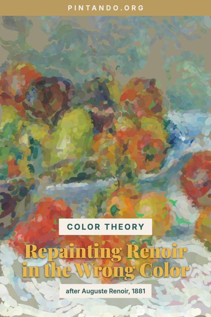
In the video I take Renoir's Fruits of the Midi and begin it backwards: the warm peppers and fruit blocked in cool and sour, almost swampy, before they ripen into the warm, sun-drenched still life Renoir actually painted. It feels like vandalism for about ten seconds, and then the colors resolve and you understand why the wrong start was the point all along.
I love this painting for the series because Renoir is doing the opposite of careful. Where a Dutch still-life master would render each grape like a jeweller, Renoir piles his southern-French produce into a loose, glowing heap and lets the color relationships do the describing. The fruit feels warm because he's surrounded it with cool. That's the whole engine, and starting from the wrong color is how you feel it work.
The painting: Fruits of the Midi, 1881
Fruits of the Midi was painted by Pierre-Auguste Renoir in 1881 and now hangs at the Art Institute of Chicago. The "Midi" is the south of France, and that's exactly what the picture is about: a tumble of peppers, eggplant, pomegranates and other southern produce spread on a pale cloth, painted in the high-keyed, broken-brushstroke language Renoir had refined as one of the central Impressionists. Around 1881 Renoir was travelling — he went to Algeria and then Italy in this period — and his work of these years is saturated with warm southern light. You can feel the heat coming off the table.
What makes it a perfect teaching picture is how unbothered it is with outline. Renoir isn't drawing the fruit and filling it in; he's building it from patches of warm and cool color sitting side by side, the way the Impressionists learned to let the eye do the mixing. Squint at it and the individual fruits half-dissolve into a shimmer — then snap back into peppers and pomegranates when you focus. That shimmer is color theory in action.
Why painters start with the wrong color
Here's the principle underneath this whole series in one line: every color has an opposite, and opposites make each other louder.
Warm reds and oranges sit across the wheel from cool blues and greens — they're complementary colors, and they have a double power. Place a warm pepper beside a cool shadow and simultaneous contrast kicks in: the warm leaps forward and glows, the cool recedes, each shoving the other to its extreme. That's why Renoir's fruit looks lit from the inside — it's hemmed in by cooler neighbours. Now bring it into watercolor and stack a second trick on top. If you underpaint a warm fruit in its cool complement and then glaze the true warm color over it, the warm ignites against the cool breathing through from below — the same emotional charge of color the Impressionists were chasing outdoors.
None of this was new even for Renoir. Renaissance painters underpainted skin with a cool green-earth verdaccio so the warm flesh glazed on top would sing against it; you can still glimpse the green in thinly painted old panels. Renoir's generation simply rediscovered the idea and turned the volume up, breaking it into visible strokes. We get to do both at once: cool complement underneath, true warm color glazed over the top.
Try it yourself
A watercolor exercise in warm-against-cool, the Renoir way. Once the glazing clicks, the same loose, color-led approach carries straight into a watercolour flowers tutorial for more practice with luminous, broken color.
- Heap up a warm subject. A few peppers, tomatoes, or oranges piled on a pale cloth — not arranged neatly, just tumbled. Warm produce is ideal because you know its color cold, so the cool "wrong" phase reads as genuinely wrong.
- Mix the cool complement. For warm red-orange fruit, mix a muted blue-green — a touch of phthalo or viridian knocked back with a little burnt sienna so it reads as a quiet, dirty teal, not a poster green.
- Block in the fruit cool. Wash that cool green over each fruit, modeling the rounded forms — darker in the valleys between fruits, lighter where the light strikes. Leave the brightest highlights as bare paper. You're building a value map, not painting leaves.
- Let it dry completely. Watercolor punishes impatience here: glaze onto a damp cool pass and it lifts into mud. Wait for a bone-dry surface.
- Glaze the true warm colors over the cool. Lay transparent reds and oranges over the dried green, thinner where the light hits so the cool glows through, denser in the cores. Watch each fruit warm up and leap forward against its complement. Keep the cloth cool and quiet so the fruit stays the star.
- Finish loose. Drop a few cooler accents into the deepest shadows, sharpen one or two edges where fruits meet, and stop. Renoir never tidied his brushwork away — let yours show too.
If your fruit looks flat, you probably kept the whole table the same temperature. Push the fruit warmer and the shadows and cloth cooler, and watch the heap inflate and glow. That warm-against-cool tension — not heavier shading — is the Renoir move, and the wrong-color start is what trains your eye to see it.
What should I paint wrong next — another Impressionist's still life, or something straight off your own kitchen counter? Tell me in the comments. I build the next batch from your suggestions.
You might also enjoy these articles: