
Van Gogh's Grapes & His Paris Color Awakening | Watercolor
Van Gogh's Grapes and the Year He Discovered Color
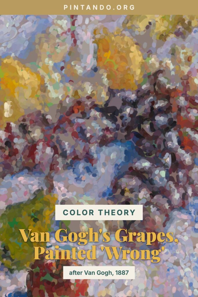
The video starts with a small scandal: a cluster of grapes from Van Gogh's 1887 still life, painted in completely the wrong color — sour yellows and acid greens where there should be deep purple — slowly resolving into the real thing. Of all the pieces in this series, the grapes give the most satisfying flip, because purple and yellow are such loud opposites that the "wrong" version genuinely makes you wince before it heals.
But I chose this painting for more than the visual punch. Grapes, Lemons, Pears, and Apples comes from a very specific, electric moment: Van Gogh's two years in Paris, when the painter we picture — all churning yellows and singing blues — was being born. Starting his grapes in the wrong color isn't just a trick. It's a way of reliving the exact discovery he made in that city.
The painting: Van Gogh in Paris, 1887
When Vincent arrived in Paris in 1886 to live with his brother Theo, his painting was still the work of the Potato Eaters period — earthy, brown, somber, Dutch. Then Paris happened to him. He saw the Impressionists and the younger artists pushing past them; he encountered Japanese prints with their flat, fearless color; he met painters experimenting with placing pure complementary hues side by side. Within a couple of years his palette detonated.
Grapes, Lemons, Pears, and Apples, painted in 1887 and now at the Art Institute of Chicago, is a record of that transformation in progress. It's a still life — modest subject, the kind of thing a painter does to practice — but he's using it as a laboratory. The yellows of the lemons and pears are set against the purples and blue-greens of the grapes; warm and cool jostle for space; the brushwork is loose and energetic rather than tidy. He isn't painting fruit so much as testing what complementary color can do when you let it collide. You can feel him learning in real time. A few years later that same logic would power the Sunflowers and the night skies.
Why painters start with the wrong color
The lesson Van Gogh was teaching himself is the one underneath this whole series: complementary colors — opposites on the color wheel — make each other come alive.
Purple grapes and yellow lemons are textbook complements. Set them beside each other and simultaneous contrast kicks in: the purple deepens, the yellow blazes, each one shoving the other toward its extreme. That's the energy crackling through Van Gogh's still life. Now bring it into watercolor and add a second layer of the idea. If you underpaint purple grapes in their complement — a warm yellow-gold — and then glaze the true purple on top, the purple ignites against the gold breathing through it. The grape stops being a flat lilac blob and starts to glow from within, exactly the emotional charge of color Van Gogh chased.
This wasn't new even in 1887. Renaissance painters underpainted skin with green-earth verdaccio so warm flesh tones would sing over the cool base — you can still spot the green in thinly painted old panels. Van Gogh's generation simply rediscovered the principle and turned the volume up, often laying complements side by side as broken strokes so the eye fused them into vibration. We get to do both: complement underneath, true color glazed over.
Try it yourself
A watercolor exercise in purple-and-gold, the Van Gogh way. Once the glazing clicks, try carrying it into a looser subject like the fox and robin watercolor tutorial for more practice.
- Pick a known-color subject with bold complements. A bunch of purple grapes with a lemon or two nearby is ideal — the colors are unmistakable, so the "wrong" phase reads as wrong and the contrast does real work.
- Mix the complements. For the grapes you'll want a warm yellow-gold underpainting (yellow ochre with a touch of raw sienna). Mix your true purple separately from a red and a blue so it stays luminous, not chalky.
- Underpaint the grapes in gold. Wash that warm yellow over the whole grape cluster, modeling the rounded forms — darker between the grapes, lighter where light catches each one. Leave tiny highlights as bare paper.
- Let it dry completely. As always with watercolor: a damp base will lift and muddy. Wait until the gold is fully dry before you glaze.
- Glaze the true purple over the gold. Lay transparent purple over the dried gold, thinner where the light hits so the gold glows through, denser in the shadow valleys. Watch each grape light up against its complement. Paint the lemons their true yellow nearby for maximum contrast.
- Punch up the contrast to finish. Deepen the darks between grapes, drop a few cool blue-purple accents, and let the lemons stay pure and bright. Keep some brushwork visible — Van Gogh never smoothed his away.
If the grapes feel dull, your purple probably smothered the gold completely — pull it thinner and let more warmth breathe through. That glow is the painting. It's the same thing Van Gogh found in Paris when he stopped painting brown and started painting light.
What should I paint wrong next? Another master mid-experiment, or something from your own fruit bowl? Tell me in the comments — the next one in the series might be your idea.
You might also enjoy these articles: