
Why I Paint Lemons Green First | Watercolor Tutorial
Why Are These Lemons Green? (And Why That Makes Them More Yellow)
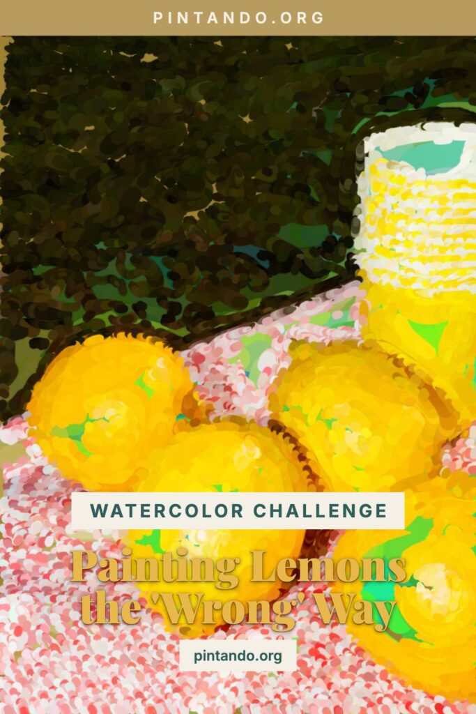
If you watched the video, you saw it: a plate of lemons that starts out a swampy, unappetizing green and somehow ends up more yellow, more sunlit, more lemon-y than if I'd just reached for yellow paint. The comments always split between "he grabbed the wrong tube" and "wait, is that lime." Neither. The green is the entire trick, and lemons are the perfect fruit to learn it on.
Here's why I love lemons for this. Everyone on earth knows what color a lemon is. There's no hiding behind "interpretation" — the second I block in that green, your brain wants it to be yellow, and that little itch of wrongness is exactly the engine we're about to use. Grab your paints. Let's start wrong on purpose.
Why painters start with the wrong color
The whole idea fits in one sentence: every color has an opposite, and opposites make each other louder.
Yellow and violet sit across from each other on the color wheel — they're complementary colors. When you put a true yellow next to, or over, a cool muted complement, two things happen. First, simultaneous contrast: your eye exaggerates the difference, so the yellow reads hotter and brighter than the same yellow would on bare paper. Second, when that yellow is a thin watercolor glaze sitting over a cool underlayer, you get a faint optical liveliness where the two hues meet through the paper — the glow that a single flat yellow can never give you. The lemon stops looking like a sticker and starts looking lit from inside.
(A quick honest note: in this exercise the "wrong" underpainting reads as a muted green rather than pure violet. That's because we're tinting a warm subject down with a cool, low-saturation base, and against yellow that base leans green — which works beautifully. The point isn't a perfect color-wheel opposite; it's a cool, quiet "wrong" layer for the warm true color to ignite against.)
This isn't a TikTok invention. Renaissance painters underpainted skin with a cool green-earth pass called verdaccio so the warm tones glazed on top would glow against it; you can still see the green peeking through in thinly painted old panels. Centuries later the Impressionists arrived at the same idea, laying complementary dabs side by side so colors mixed in your eye instead of on the palette. Same principle, different toolkit. We're just doing it with a bowl of lemons.
The lemon challenge
What makes lemons such a good first subject is that they punish you in a useful way. The form is simple — a rounded oval with two little nipples at the ends — so you're not fighting the drawing. All your attention goes to the color relationship, which is where the lesson actually lives.
And lemons hide a second trap that teaches you something. Their surface isn't smooth; it's dimpled, slightly waxy, and it bounces light in a particular way. The instinct is to chase all that texture with yellow detail far too early. Resist it. If you build a clean cool base, dry it, and glaze one confident yellow on top, the dimples and sheen almost paint themselves in the way the glaze settles. Over-working the yellow is the single most common way to turn a glowing lemon into a muddy one — the wrong-color method works precisely because it forces you to be patient.
Try it yourself
A complementary-underpainting exercise you can do this afternoon with whatever watercolors you own. Once the glazing clicks, the same approach carries straight into a watercolour flowers tutorial for more luminous practice.
- Set up a known subject. Two or three lemons on a plate, real or from your phone. The point is a subject whose true color you already know cold — that's what makes the "wrong" phase read as wrong.
- Mix a cool, muted base. A grayed green works best here: a touch of sap green knocked back with a little burnt sienna so it's a quiet, dirty green, not a poster green. You want subtle, not shocking.
- Block in the lemons in that base. Paint the shape and shadow of each lemon — darker on the undersides, lighter where the light hits. Resist detail. You're building a value map, not a lime.
- Let it dry completely. This matters in watercolor. Glazing onto a damp base lifts and muddies it. Go make tea. Dry paper, clean edges.
- Glaze the true yellow on top. Drop a transparent yellow over the dried base, keeping it thin so the cool breathes through in the shadows. Watch the yellow ignite where it crosses the green. Leave the lightest spots nearly bare for sparkle.
- Finish with bright touches. Add the dimpled texture with tiny flecks, a sharper dark where lemons meet, and a pinpoint of bare paper for the highlight. Done.
If your first attempt looks muddy, it's almost always one of two things: the green was too bright, or the yellow went on too soon. Mute the green, wait for dry, try again. It's a forgiving exercise precisely because the subject is so familiar — you always know which way to push.
So: what should I paint wrong next? A tomato under blue? A goldfish under green? Tell me in the comments — the weirdest suggestions usually make the best videos.
You might also enjoy these articles: