
Van Gogh's Fruit & His Colored Ground | Watercolor
Van Gogh Painted the Background Wrong on Purpose — So I Paint the Fruit Wrong Too
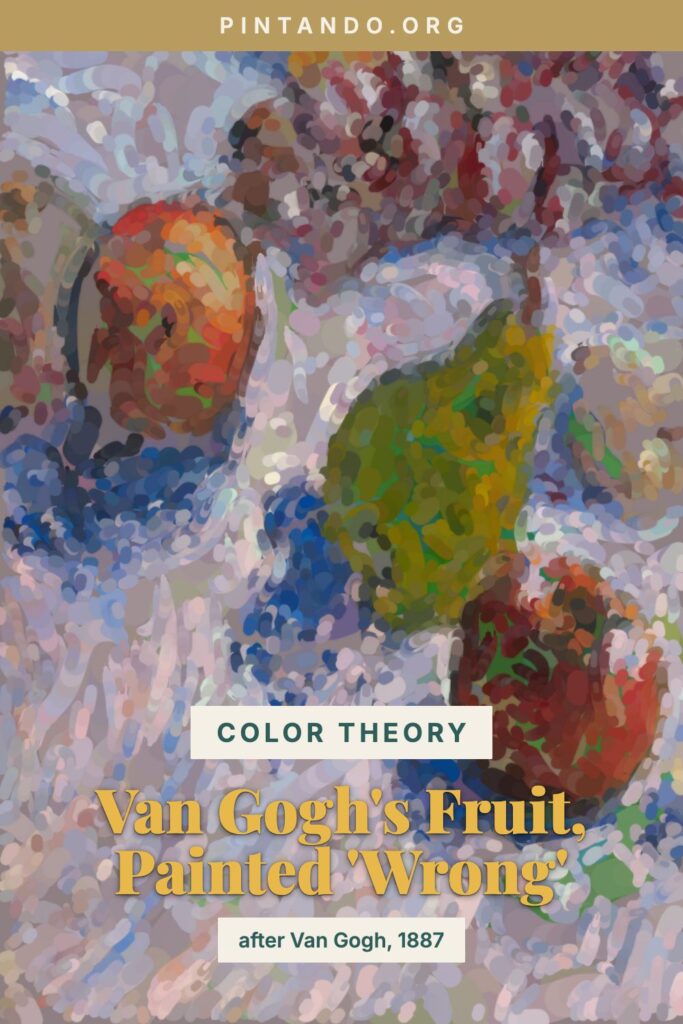
In the video I take a corner of Van Gogh's 1887 still life — a pear and apples — and start it backwards: the warm fruit blocked in cool and green before it ripens into the gold-and-red the painting is famous for. But there's a quieter trick hiding in this picture, and it's the one I really want to talk about: it isn't only the fruit that's painted in a surprising color. Look at what Van Gogh did with the ground the fruit sits on.
I've already written about the grapes from this same painting and the Paris color awakening behind it — the year Van Gogh's brown Dutch palette detonated into pure color. This piece zooms in on a different lesson from the very same canvas: the deliberately colored ground, a pale, cool violet-toned surface that he chose specifically to make warm fruit leap off it. Same painting, different secret.
The painting: a complementary-color laboratory, 1887
Grapes, Lemons, Pears, and Apples was painted by Vincent van Gogh in 1887, during his Paris years, and now hangs at the Art Institute of Chicago. The museum is blunt about what he was up to: in this work Van Gogh explored complementary colors — yellow and purple, blue and orange, red and green — in the service of sheer chromatic intensity, with the contrasts heightened by his pulsating, broken brushwork. This is a painting about color opposites, made by a man teaching himself a new language.
It also has one of the great provenance stories in the series. After Van Gogh's death the picture passed through his brother Theo, then to the painter Émile Bernard, then to the dealer Ambroise Vollard — and finally into the personal collection of Edgar Degas, who owned it until his death in 1917. One great artist's color experiment ended up on another great artist's wall. That's not nothing.
But the detail to fix on is the ground. Rather than dropping his bright fruit onto a neutral brown or white cloth, Van Gogh worked it against a pale, cool, violet-leaning surface. A warm apple on a cool violet ground is a complementary pairing before you've even painted the fruit's own color — the background is doing half the glowing. That's the lesson here: the surface a thing sits on can make or break its color.
Why painters start with the wrong color
Here's the principle in one line: complementary colors — opposites on the color wheel — make each other come alive.
Warm yellow-orange fruit against a cool violet ground is exactly that pairing. Set them together and simultaneous contrast kicks in: the fruit warms and advances, the ground cools and recedes, each shoving the other to its extreme. Van Gogh got half his luminosity for free, just by choosing the right color to put behind the fruit. Now bring it into watercolor and add a second layer of the same idea, this time under the fruit. If you underpaint a warm apple in its cool complement and then glaze the true warm color on top, the warmth ignites against the cool breathing through from below — the emotional charge of color Van Gogh was chasing in every inch of this canvas. Cool behind, cool beneath, warm on top: the fruit glows twice.
It's old knowledge in new clothes. Renaissance painters underpainted skin with cool green-earth verdaccio so warm flesh would sing over it — you can still spot the green in thinly painted old panels. Van Gogh's generation rediscovered the principle and cranked it up. We get to use both halves: a colored ground and a complementary underpainting.
Try it yourself
A watercolor exercise in warm fruit on a cool ground, the Van Gogh way.
- Set up warm fruit on a cool surface. A pear and a couple of apples on a violet or blue-gray cloth. The cool ground is half the lesson — don't skip it for plain white.
- Tint the ground cool first. Lay a pale, muted violet-gray wash across the whole background and let it dry. This is the "wrong" surface that will make everything warm pop later.
- Block in the fruit in its cool complement. Over each fruit, wash a muted green (a touch of sap green knocked back with burnt sienna), modeling the form — darker in the cores, lighter where light hits. Leave highlights as bare paper.
- Let it dry completely. Watercolor punishes impatience: glaze onto a damp pass and it lifts into mud. Wait for bone-dry.
- Glaze the true warm colors over the cool. Lay transparent golds and reds over the dried green, thinner where the light hits so the cool glows through, denser in the shadows. Watch the fruit warm up and leap off both the cool ground and its own cool underlayer.
- Finish with Van Gogh's brushwork. Add directional, broken strokes, drop a few blue accents into the deepest shadows, and let the ground's violet peek between the forms. Keep the marks visible — Van Gogh never tidied his away.
If the fruit feels flat, check the ground before you blame the fruit — a background that's too warm or too neutral steals the contrast. Cool it down and the fruit ignites. That's the hidden engine of this little painting: Van Gogh didn't just paint warm fruit, he built a cool world for it to glow inside.
What should I paint wrong next — another corner of a Van Gogh, or something off your own table? Tell me in the comments. The next one might be your idea.
You might also enjoy these articles: